Introduction
A map is not the same size as the piece of the earth it is describing. This sounds obvious, but two important cartographic principals flow from this statement.
The first is scale – the mathematical relationship between the size of the map and the size of the piece of earth it is describing.
The second is generalisation – the process of making decisions as to which features are included or not included on a map.
Scale
All maps have a scale, which may be simple (for single scale maps) or complex (for multi-scale maps). Modern maps have the advantage of using advanced earth measuring techniques and map projections, which results in more accurate mapping, with a reliably consistent scale applied across the face of the map.
This is based on a ‘flat earth concept’ – i.e. that there are no hills or valleys. As such it is a horizontal scale which makes no allowance for slope.
The scale of a map is usually depicted in two ways
- Statement of Scale
This states the ratio between the map and the piece of the earth it is describing (called a Statement of Scale)
An example is 1:100,000 – This states that every unit on the face of the map is equivalent to 100,000 units on the face of the Earth. In other words; 1 centimetre on the map is equivalent to 100,000 centimetres (i.e. 1 kilometre) on the Earth. - Scale Bar
This can be used to measure real-world distances on the map.
For more information and examples of both methods refer to Information about maps (Marginalia).
Generalisation
As the area of land that is being mapped becomes larger (e.g. Tasmania instead of Hobart) fewer individual features are able to be shown on a map. For example at 1:100 all the individual trees in an area could be depicted, but not at 1:100,000. Decisions need to be made about what is important to retain on the map and what can be dispensed with or shown in another manner – for example:
- show only a selection of trees
- show the trees as a forest area
- show no trees.
This decision is dictated by the map’s purpose and how ‘cluttered’ it can become before it becomes unusable. This process of selecting items for inclusion, exclusion or amalgamation is called generalisation, and all maps do it.
Because of the importance of some features, it is sometimes important to show a number of features on a map, regardless of the scale being used.
Consider roads and railways on topographic maps. For this type of map, it is important to show both. However, they are often very close to each other on the ground, on the map their symbols would overlap and be unreadable. Conventions allow for both to be shown on the map by moving one of the features away from the other. This process of deliberately moving features away from their true location is called cartographic generalisation, and not all maps use it.
→ Read more about generalisation in A Map Users Guide to Reading Tactual and Low Vision Maps.
Add the Two Together
Before a map is made it is necessary to first decide on the level of generalisation and map scale – these decisions dictate how the map is made.
An Example
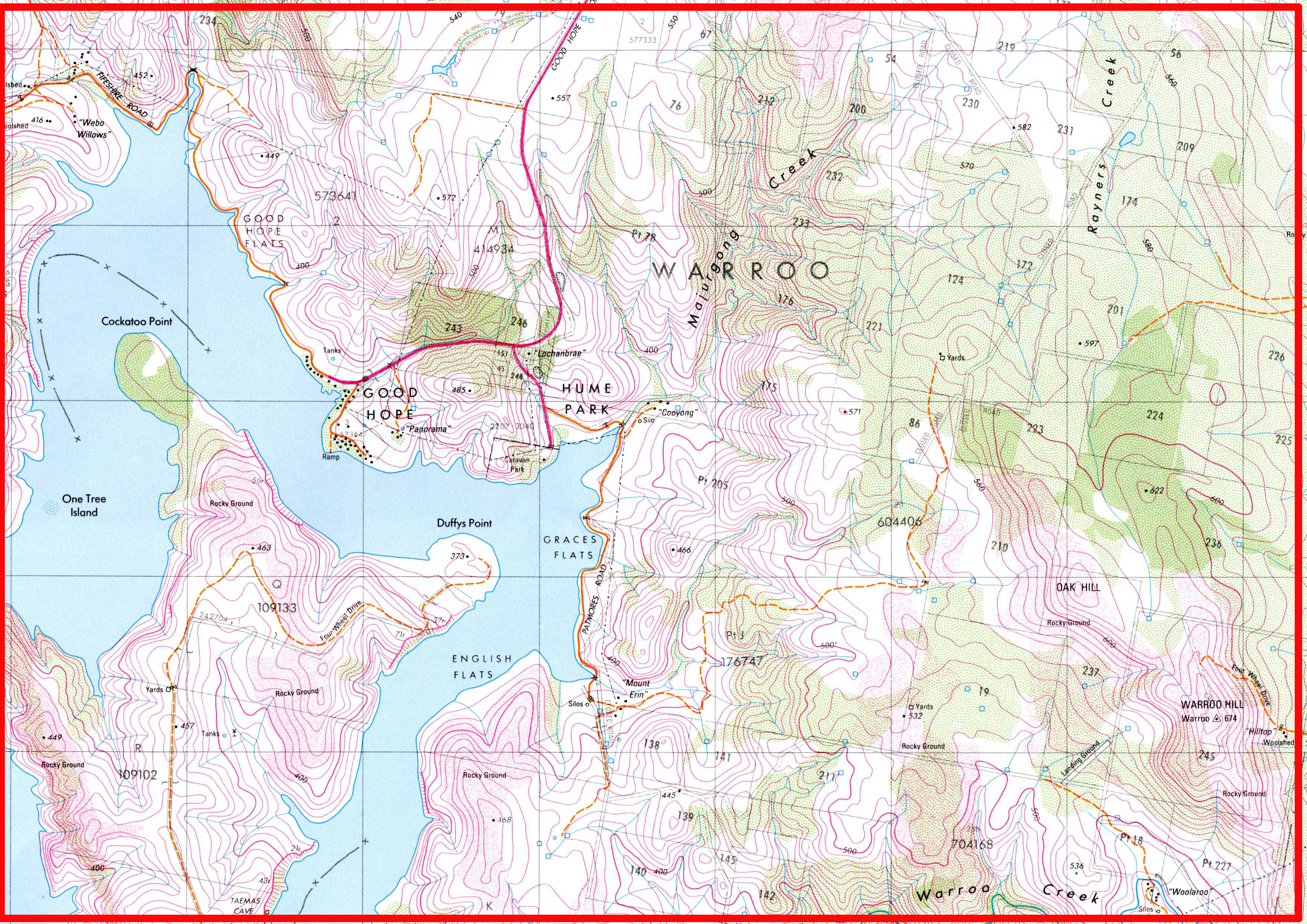
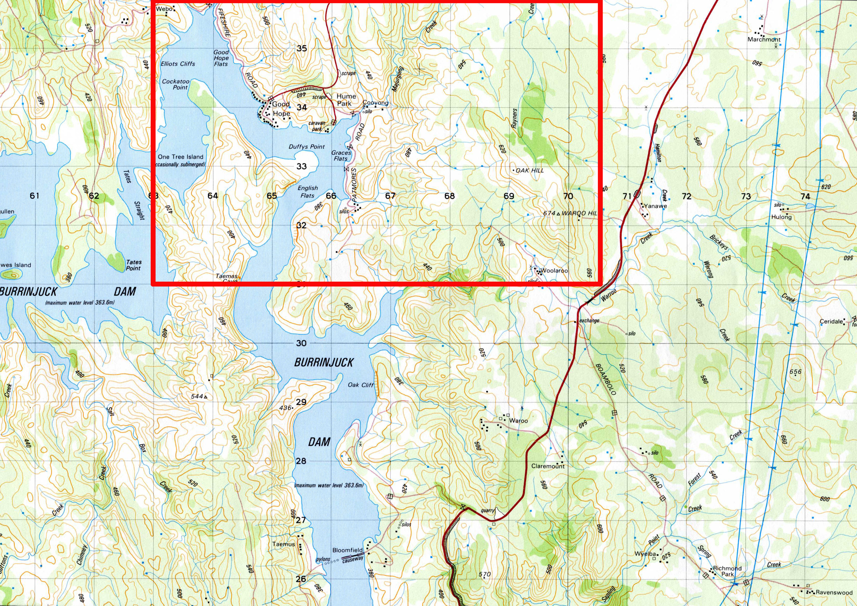
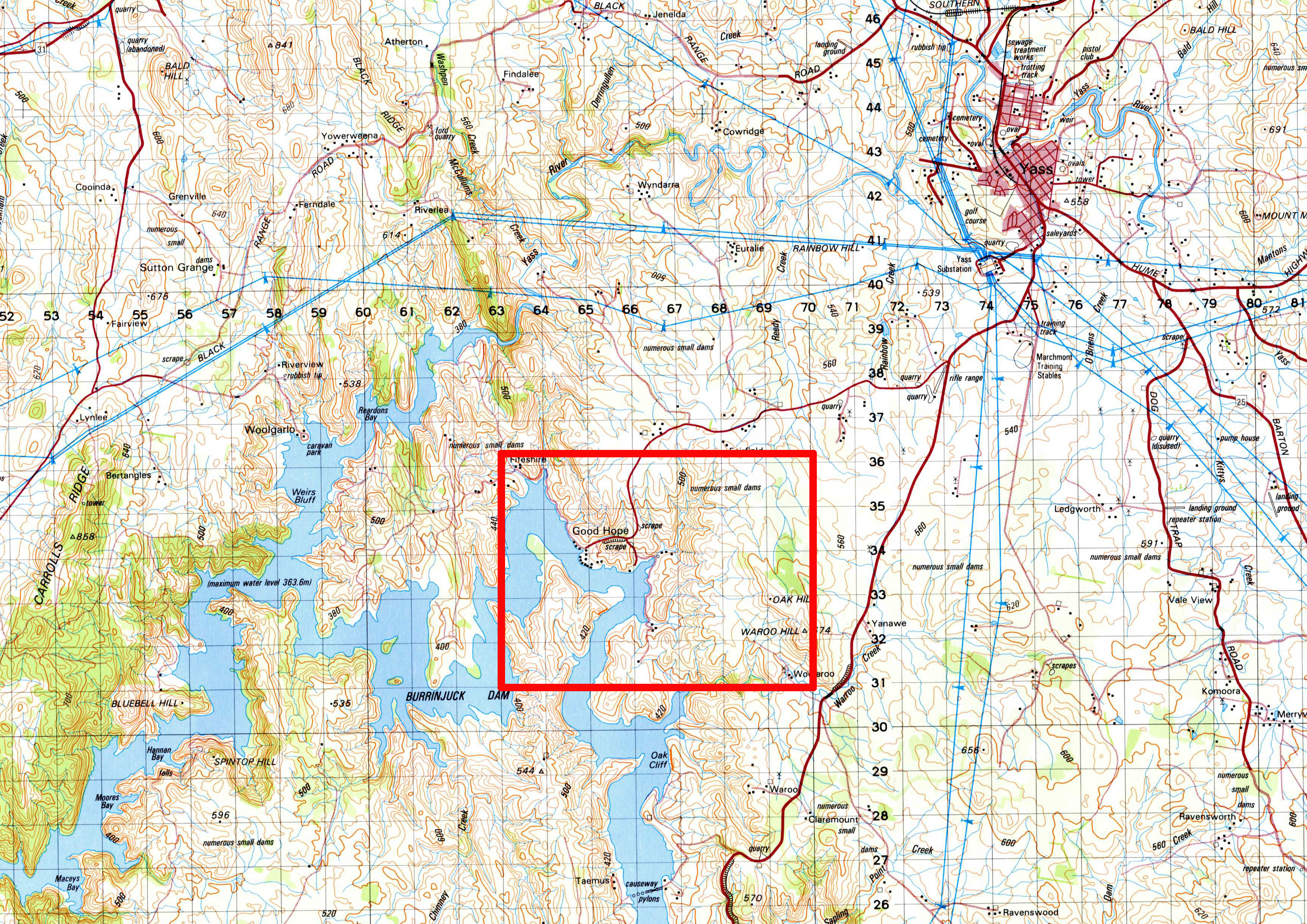
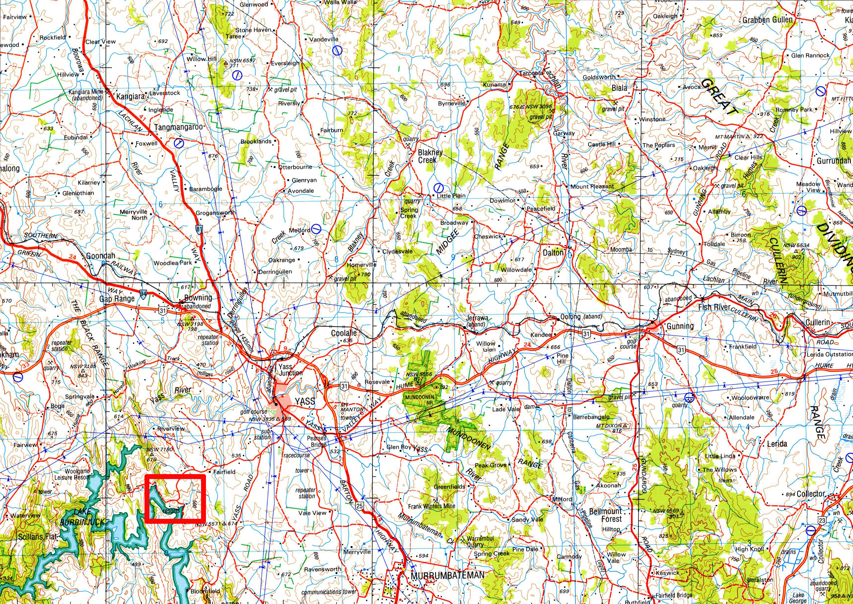
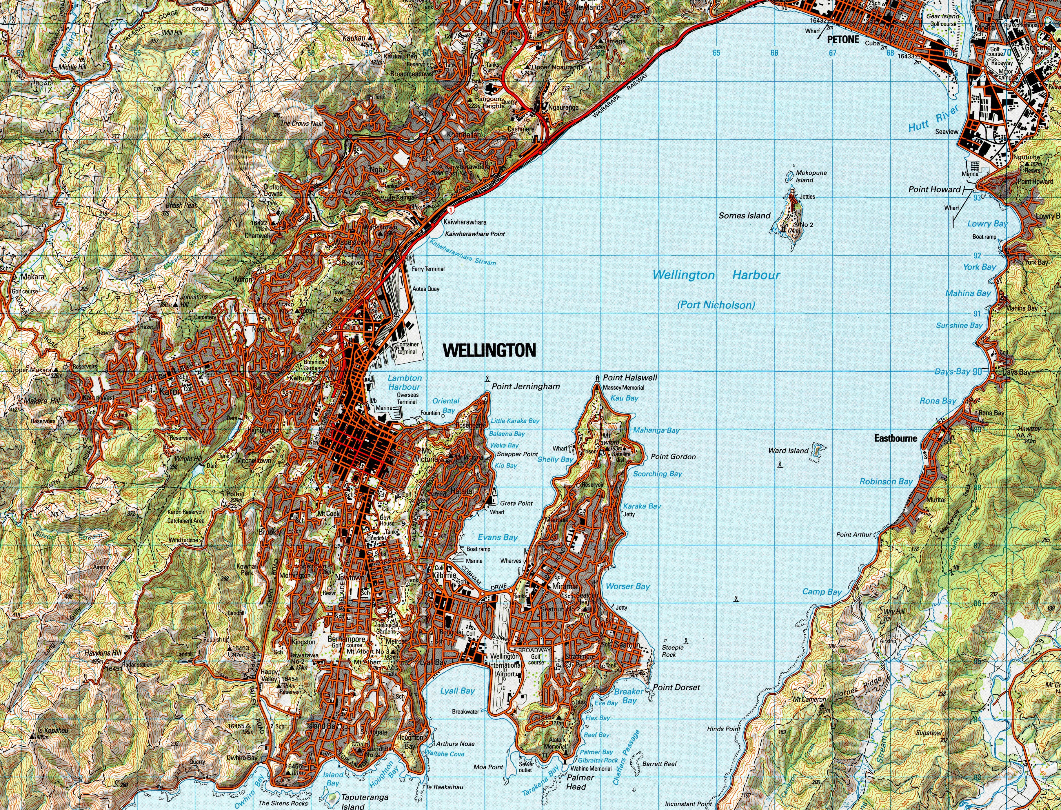
These maps are extracts from four different scale topographic maps. They each represent the ‘same sized piece of paper’ and the extent of the first map is indicated by the red square.
Ignore the differences in appearance of each, not only are they from different scale maps, they are from different map series and therefore have different specifications.
In terms of the map content there are two things to notice as the scale changes (from 1:25,000 to 1:250,000) and the ‘piece of paper’ stays the same:
Firstly, the extent of the area shown increases. For example, at 1:100,000 scale the nearby city of Yass is shown and at 1:250,000 the distant town of Gunning is also shown. If you only used the 1:25,000 and 1:50,000 scale maps you would not be aware of the existence of either of these settlements.
Secondly, the red square becomes smaller and the amount of information shown within it is increasingly reduced (this is an example of generalisation due to scale changes).
For example, for the settlements of Good Hope and Hume Park:
- at 1:25,000 scale every building (the black squares) is shown
- at 1:50,000 and 1:100,000 scales only a few buildings are shown
- at 1:250,000 only one building is shown (regardless of how many buildings there actually are) and the settlements are no longer individually named – they are simply labelled as resorts.
Explaining Some Jargon – Small and Large Scale Maps
As the scale of a map changes from a smaller number to a larger number (eg from 1:100 to 1:100,000) the area of the Earth’s surface which can be shown increases, but the amount of detail which can be shown decreases. (This is described in more detail above.) This change in relationship has resulted in the creation of some commonly used jargon which can be very confusing:
- small scale maps
show less detail, cover larger areas (eg a country) and typically have a scale which has a high ‘number’ (eg 1:1,000,000) - large scale maps
show more detail, cover smaller areas (eg a city) and typically have a scale which has a low ‘number’ (eg 1:1,000)
Putting this description in simpler terms:
- smaller scale maps have smaller level of detail and cover a bigger area
- larger scale maps have larger detail level of detail and cover less area
In the 4 examples above the LPI, Warroo map is the largest scale map and Geoscience Australia, Goulburn map is the smallest scale map. This principle is demonstrated more dramatically by these two maps – one is at 1:3,000,000 (the smallest scale map) and the other is at 1:50,000 (the larger scale map).
A complicating factor is that here is no hard–and–fast rule as to which scales are described as small, medium or large – it all depends on your point of view. In simplistic terms, the scale that an organisation most commonly usually uses for their maps is regarded by them as medium scale, with the small and large scales occurring ether side of it.
For example:
| large scale | medium scale | small scale | |
|---|---|---|---|
| Town Planner |
< 1:2,000 | 1:2,000 to 1:5,000 | > 1:5,000 |
| State Mapping Agency |
< 1:25,000 | 1:25,000 to 1:100,000 | > 1:100,000 |
| Australian Mapping Agency |
< 1:100,000 | 1:100,000 to 1:1,000,000 | > 1:1,000,000 |