Types of Maps – Topographic Maps
Introduction
Like General Reference Maps, Topographic Maps are a summary of the landscape and show important physical (natural and man-made) features in an area. The primary difference is that they show elevation in detail.
Characteristics of topographic maps include:
- they show elevation using contour lines. Put simply, a contour line is a line which joins points of equal elevation above sea level
- they have an emphasis on showing human settlement (roads, cities, buildings etc), but may include some thematic information such as vegetation or the boundaries of national parks
- they are typically produced by government agencies – these are often specialist mapping agencies and may have either a civilian or defence purpose
- they have well defined standards (called Specifications) which are strictly adhered to – these vary between mapping agencies and the scale of the map
- they have very good location reference systems – including latitude and longitude, but may also have grid lines
- often have additional information such as an arrow pointing to Magnetic North as well as True North.
As there is an exceptionally large amount of information about Topographic Maps available online (more so than any other form of mapping) we shall give a very simple overview of it. See Further Reading below.
Topographic maps are usually part of a series of maps, but may be one–off / stand–alone maps.
Understanding Contours
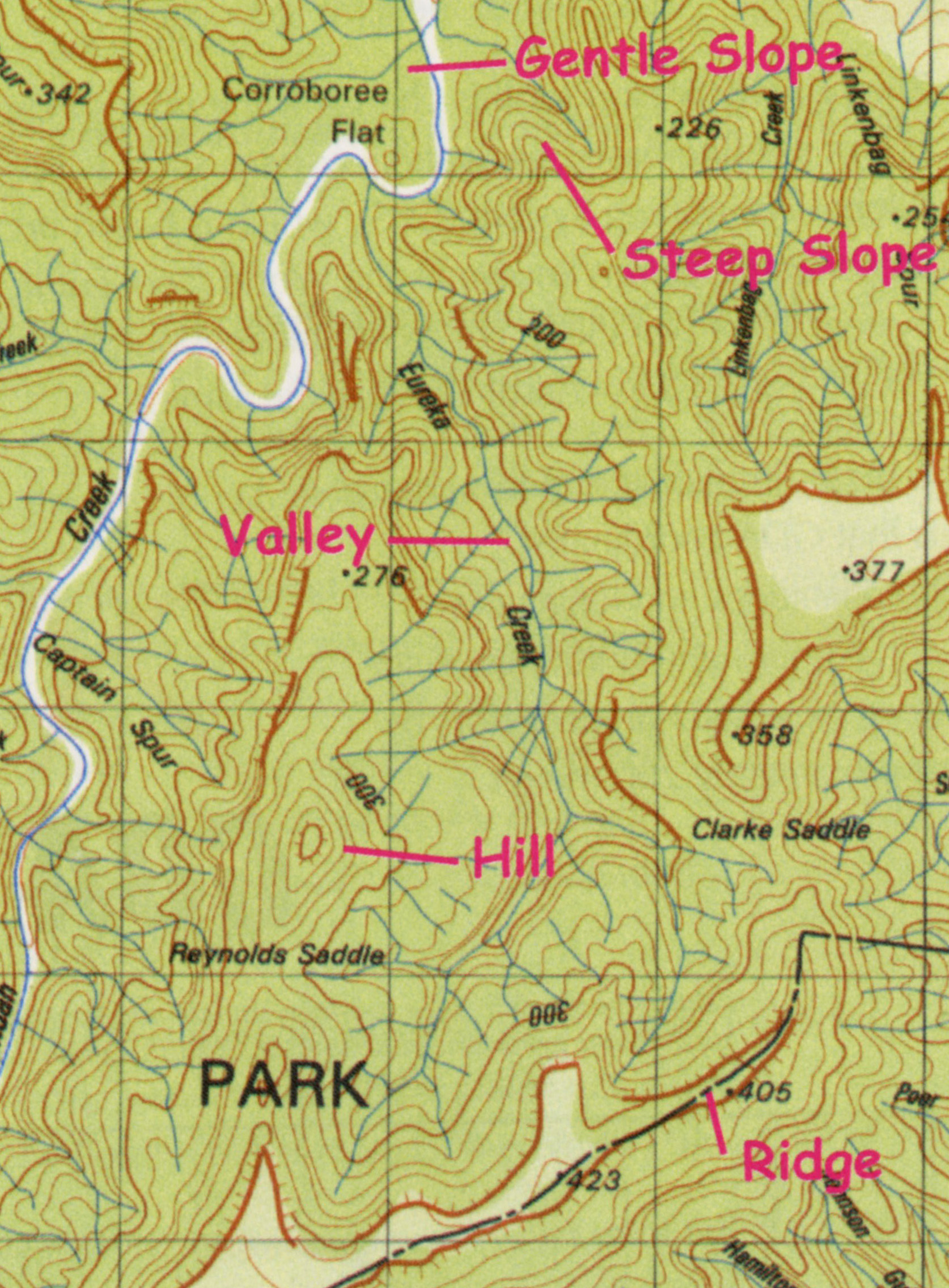
Elevation is usually shown using contour lines. In simplistic terms a contour line is a line which joins points of equal elevation. Where these lines are above sea level they are simply called contour lines and where they are below sea level they are called bathymetric contour lines.
Contour lines can tell an informed reader many things about the shape of the land and its ruggedness. The closer contours are together the steeper the land and the further they are away from each other the flatter the land. On the Nullarbor Plain, for instance, very few contour lines would be shown, but over the Snowy Mountains an enormous number of contour lines would be shown.
A word of warning: topographic maps do not show every contour line, rather they choose sample of the lines. For example every 20, 50, 200 metres – depending on the scale of the map. This is called the contour interval of the map. As a result of this selection process, the difference in density of the contour lines is only indicating relative changes in the shape of the landscape – on that map!
The reading of topographic maps and interpretation of contour lines, is a much written about topic. Please refer to the Further Reading hyperlinks to learn more about contours and understanding what they mean.
A bit of history: Contours were developed in the 19th century (1800s). Prior to this, various systems of drawing the relief had been experimented with, including a system called hachuring. These systems have largely disappeared from modern map making, but they are intriguing to read about. This site from the University of Portsmouth has a very interesting historic summary of the changes over the years: http://www.geog.port.ac.uk/webmap/hantscat/html/ftr_hil.htm
→ Read more about contours in A Map Users Guide to Reading Tactual and Low Vision Maps.
Topographic Maps as a Summary of the Landscape – an example
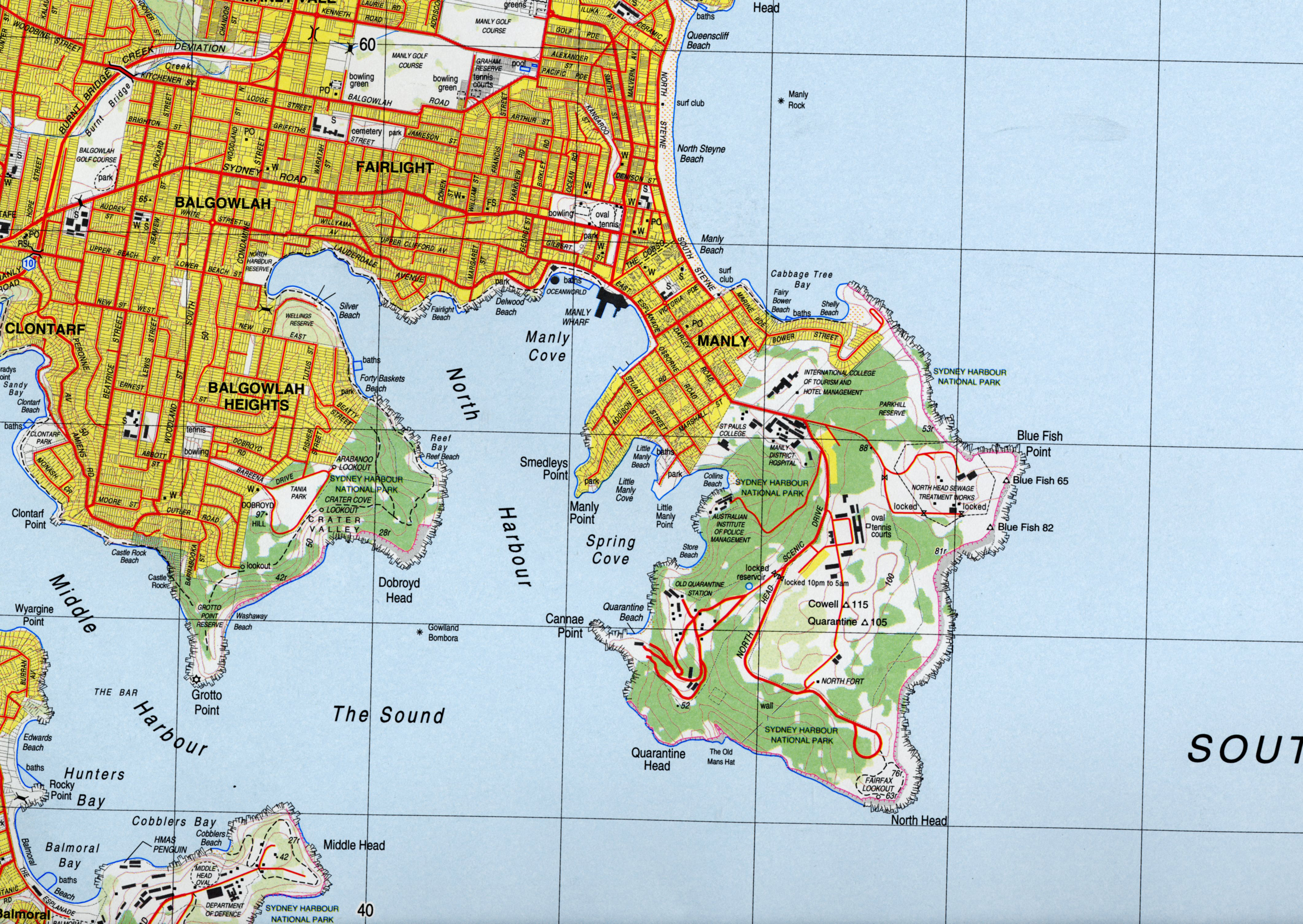
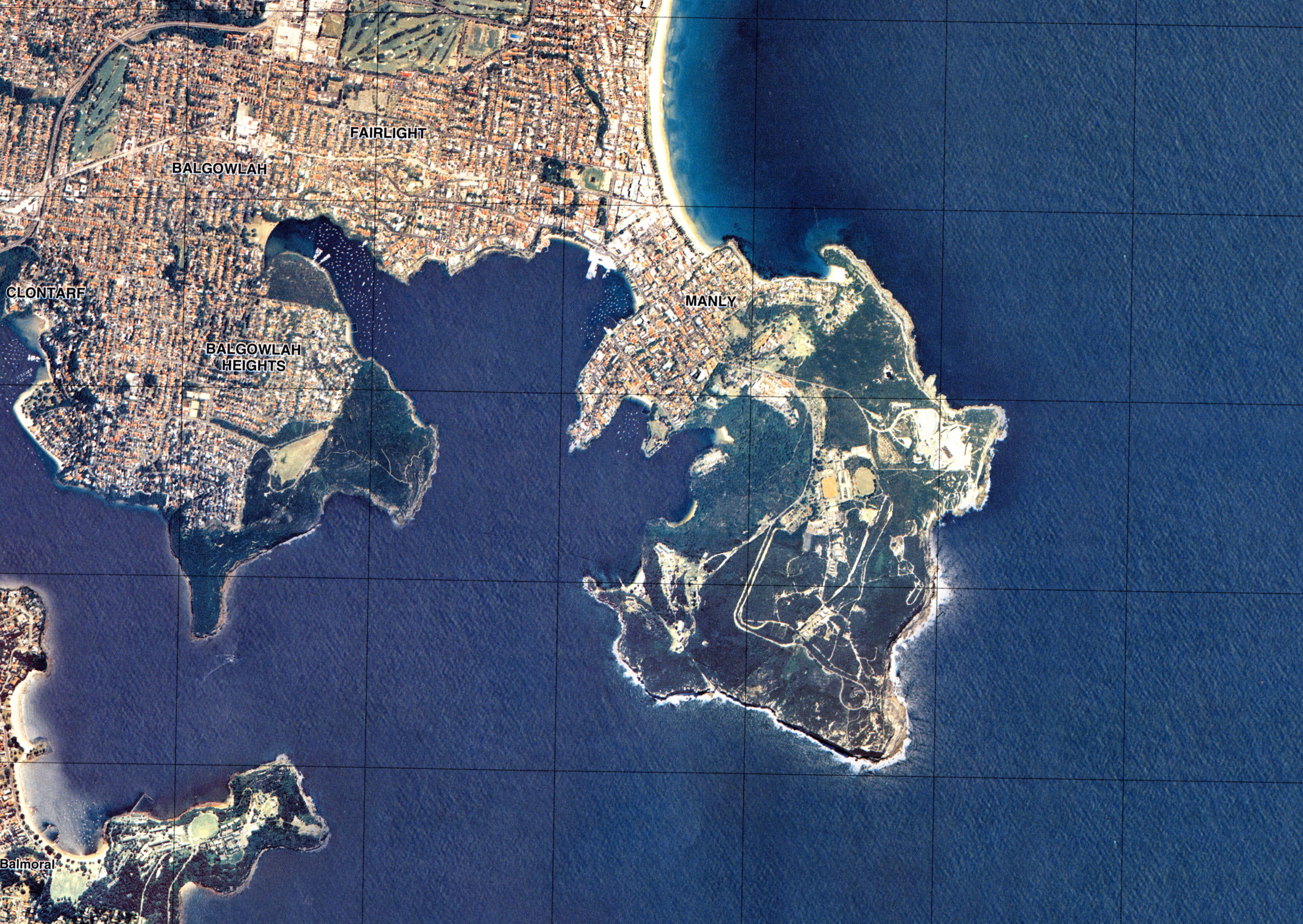
This topographic map and photograph are of the same area – the Manly region within Sydney, NSW. By comparing these two it is clear that the map is an excellent summary of the landscape of the area. Note that the features which dominate the photograph also dominate the map. And, because it is a topographic map, it also gives detailed information about the ‘bumpiness’ of the land.
A 'Potted' Geography of Australia using Topographic Maps
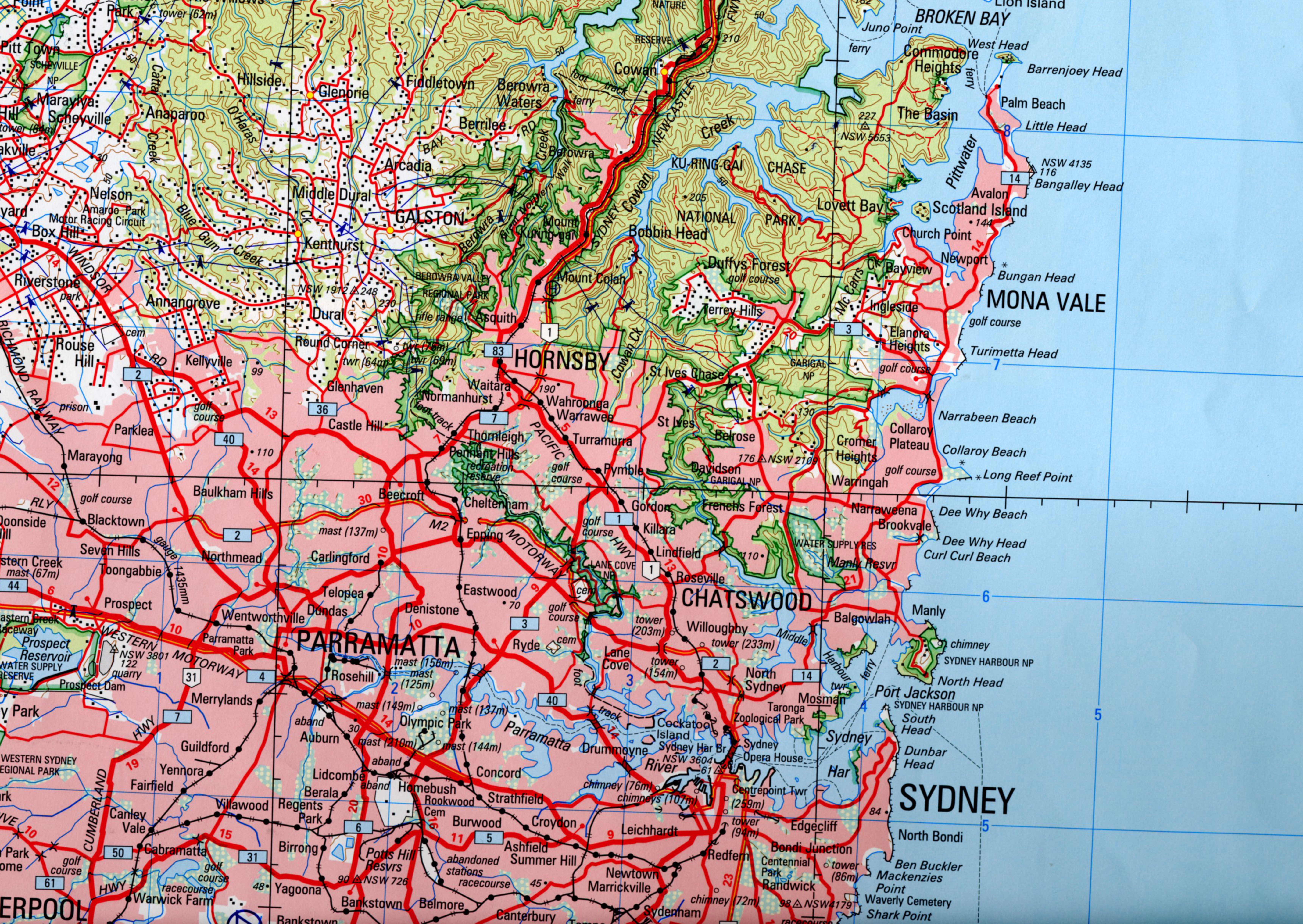
Four maps have been selected across Australia to illustrate the vast range of information which can be contained in a topographic map. These maps are all part of a series of maps which cover the whole of Australia and they have been produced using the same specification – i.e. any difference in appearance of the map is the result of a difference in the landscape.
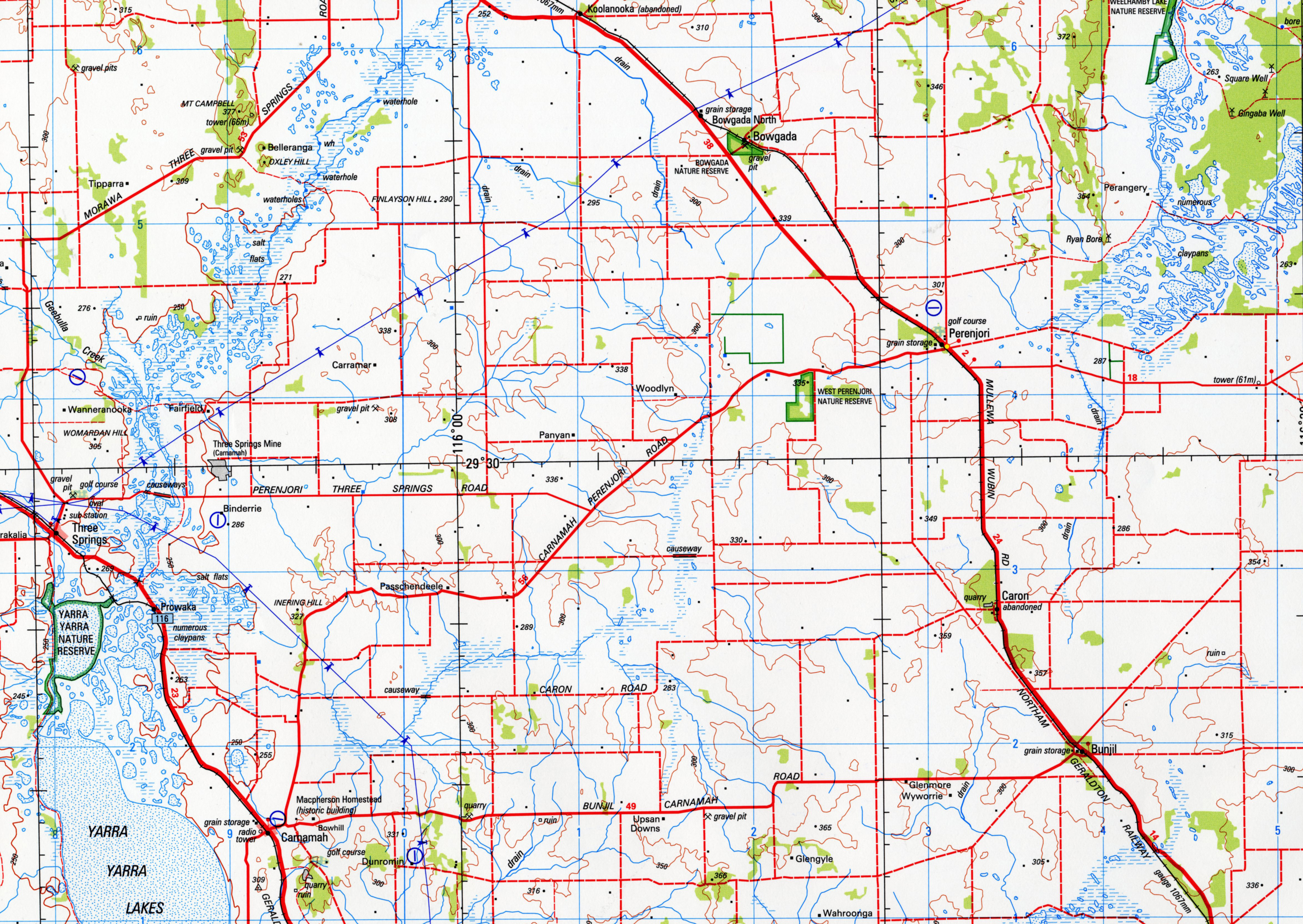
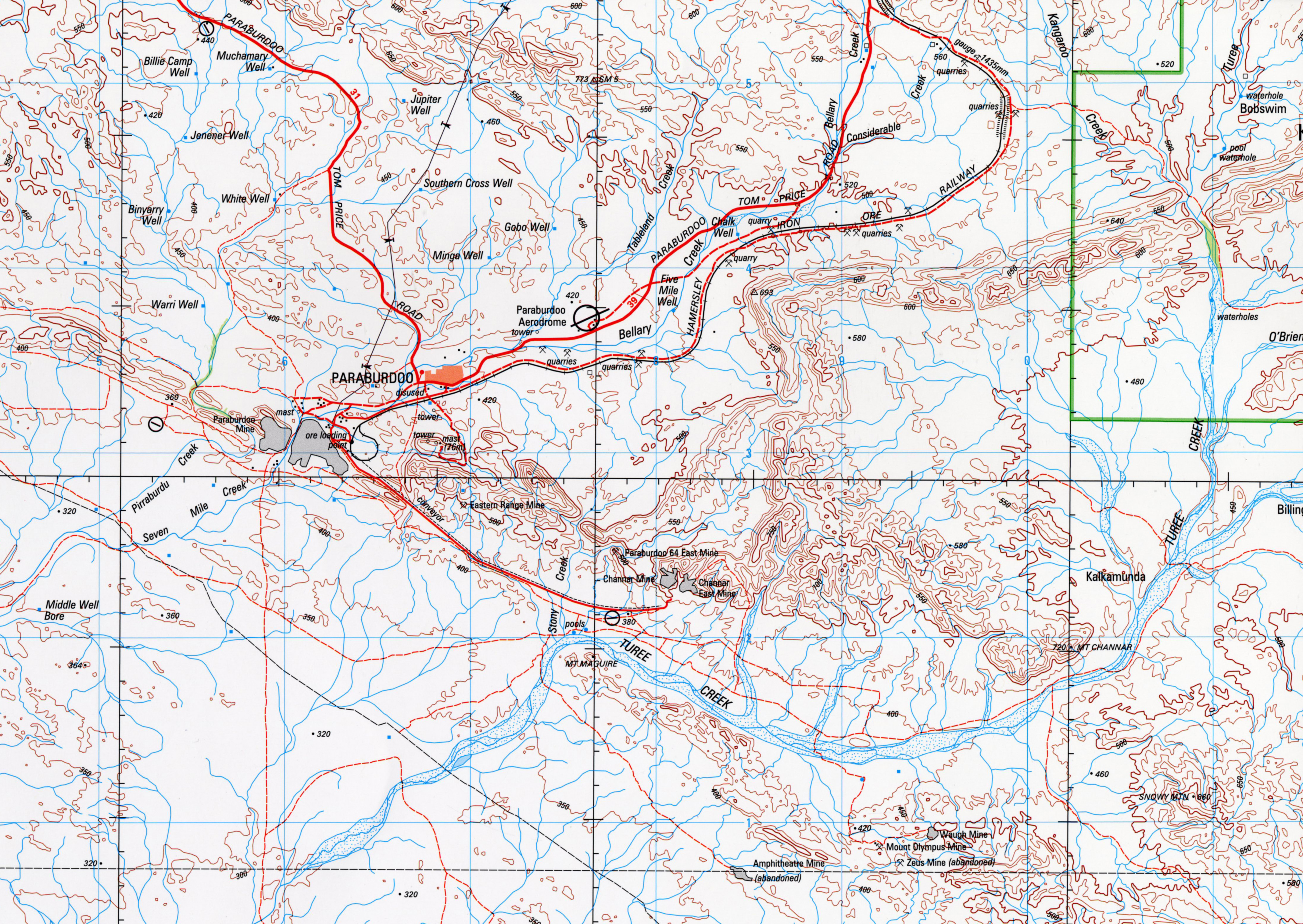
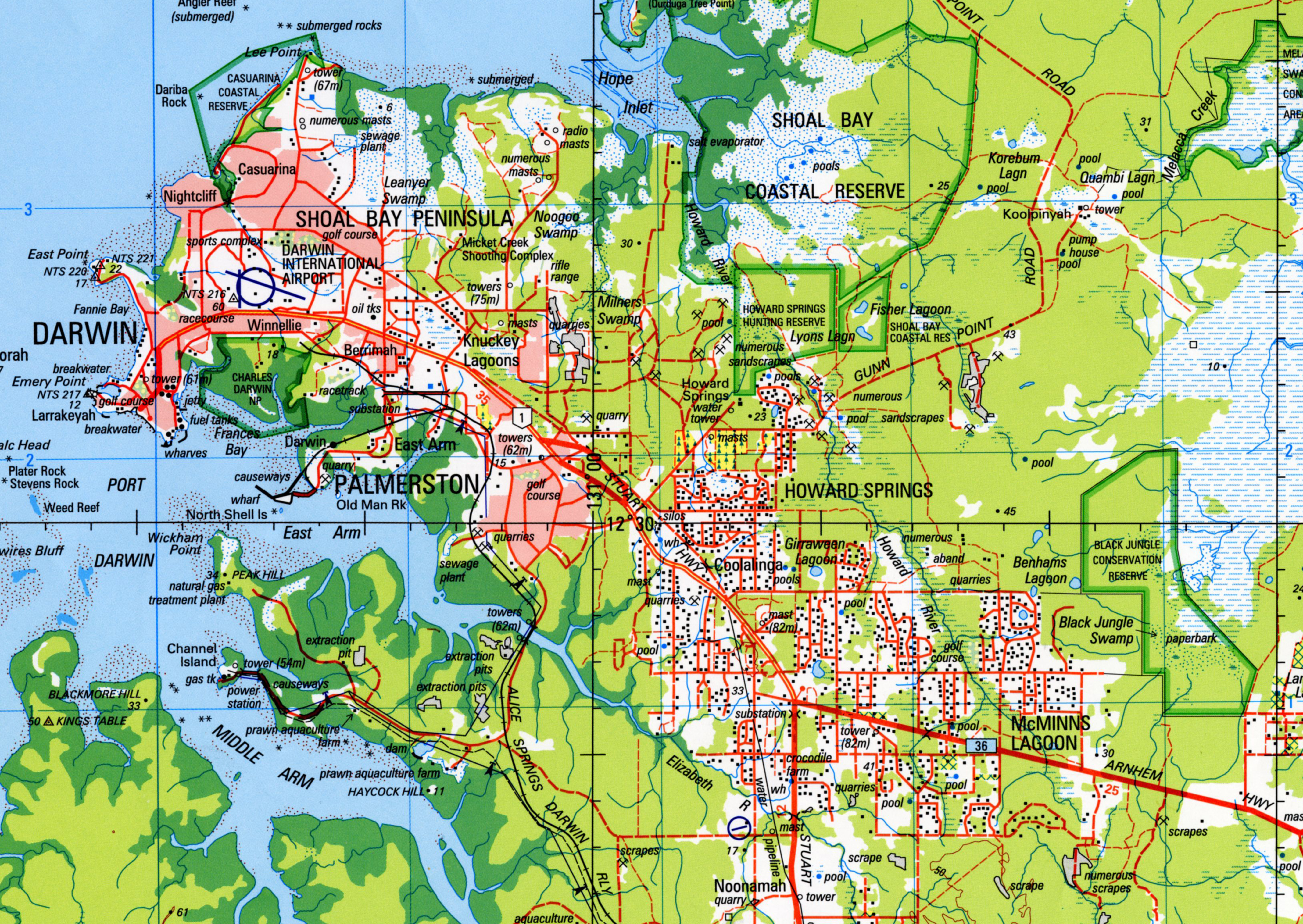
A feature present here that has not been shown on the other two maps is vegetation. This doesn't mean that there is no vegetation on the other maps, rather they have simply opted to not show it or the vegetation is less dense. Forested land is shown in light green and mangrove areas in dark green. Please note that this adds colour to the map, but can make the contour lines hard to see.
Explaining Some Jargon – Topographic Map Numbering Systems
For series maps, particularly topographic series maps, a variety of map conventions have been developed. One which can be confusing is the different map numbering systems.
In series maps it is essential that individual maps should be easily and uniquely identifiable. Map name alone is not sufficient to easily identify and locate an individual map. This is especially a problem where there are a large number of maps in a topographic map series. For example in Australia there are:
- 513 individual 1:250,000 scale topographic maps, and
- 3,066 individual 1:100,000 scale topographic maps
This problem was partly solved by the development of a numbering system for the International Map of the World (IMW). This system hinged on two features:
- a well defined, regular, smaller scale grid was developed for the whole Earth’s surface
- larger scale maps were 'nested' inside this grid
It was agreed that the smaller scale grid should be for 1:1,000,000 (often called 1:1 million scale) topographic mapping. The 'nested' smaller scales were 1:250,000, 1:100,000, 1:50,000, 1:25,000 etc.
The International Map of the World and its Numbering System
In 1891 the Fifth International Geographical Congress agreed on the development of a world-wide, 1:1,000,000 (or 1:1 million) scale series of maps. This was to be called the International Map of the World (or IMW for short). The maps were to be produced using an internationally agreed, consistent specification.
For several reasons the development of the IMW maps was slow – reasons included two World Wars, the Great Depression and lack of funding in poorer countries. International interest waned and by the 1980s only 800-1000 of the proposed 2500 maps were completed. The project was abandoned by the mid-1980s. The Australian component of the IMW was 49 maps. Work on these began in 1926 and was completed in 1978.
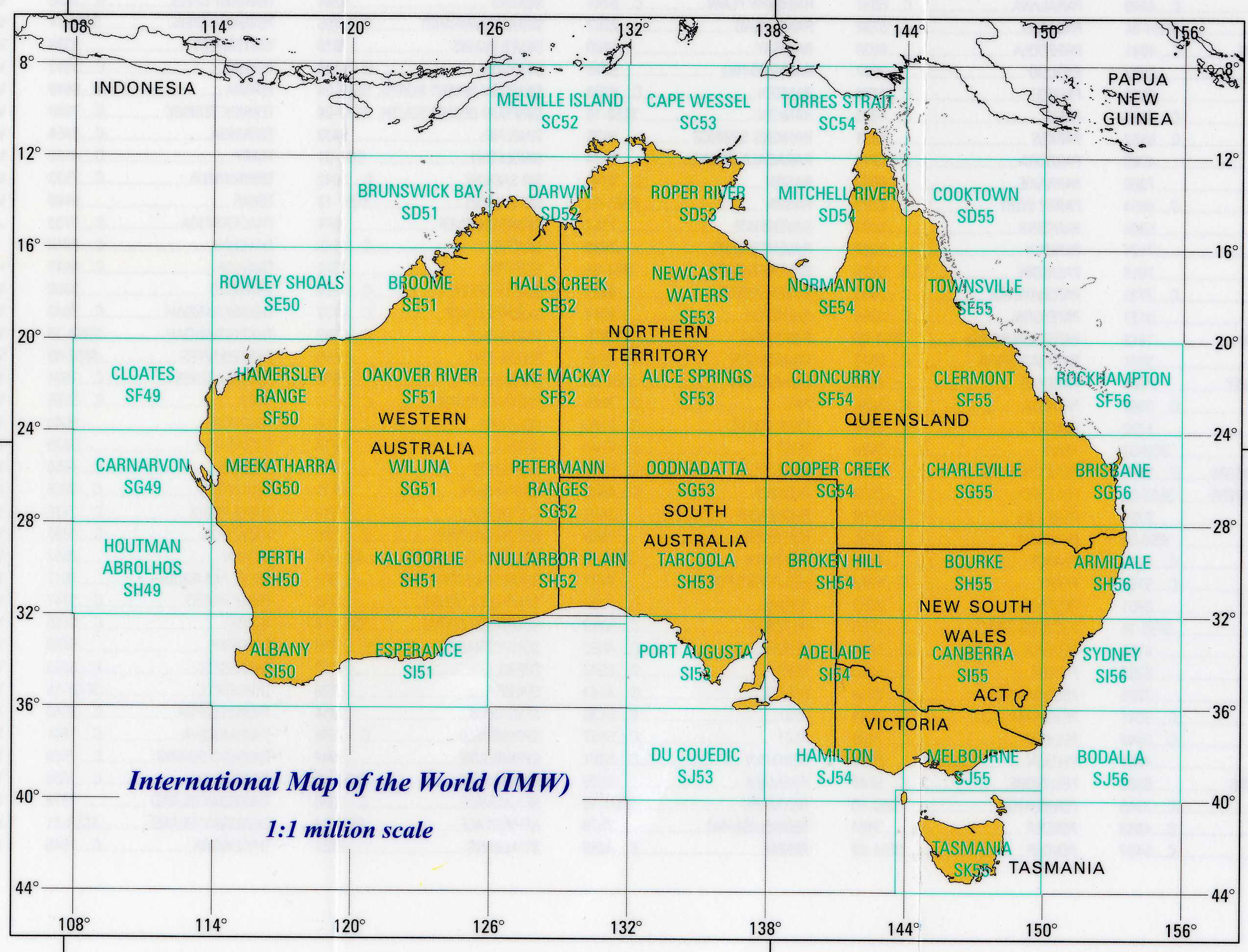
- unique name
- is located in an IMW latitudinal zone (starting with the letter C in the North and ending with the letter K in the South)
- is located in an IMW longitudinal zone (starting with the number 49 in the West and ending with the number 56 in the East)
The enduring legacy of the IMW map series is its map numbering conventions. The regular grid it developed consisted of:
- 4° wide latitudinal zones for the whole earth numbered A to V, away from the Equator; and with the letter N or S (to identify either the Northern and Southern Hemispheres).
- 6° wide longitudinal zones were for areas between the latitudes 60° numbered 1 to 60, East to West starting at the 180°
- 12° or 24° wide longitudinal zones between the latitudes 60° and 90°.
Using this method a regular grid was created, and each had a unique number. For example, in the case of Sydney, Australia, its IMW grid cell (variably called an IMW zone, IMW map zone or IMW map) would be identified as:
- S – for the Southern Hemisphere
- J – for the latitudinal zone it belongs to
- 56 – for the longitudinal zone it belongs to
Add the three together and Sydney, Australia is found in the IMW zone of SJ56. This numbering systems allows a map user to locate a map anywhere on the surface of the Earth – using only the number as a guide.
In addition to this, each IMW map zone is uniquely named. In the case of the Sydney, Australia example the map sheet is SJ56, Sydney. Where the extents of a map are different to the standard IMW zones (to totally cover a city) the word 'Special' is added to the map name.
Numbering 1:250,000 Scale Topographic Maps
The next step in the numbering system is easy – based on convention, there are 12 individual 1:250,000 scale maps in an IMW zone. These are each numbered 1–12 in a regular pattern. This is added to the IMW zone number and another unique number is created. In the case of the Sydney example above, the IMW map sheet is SJ56 and the 1:250,000 scale map called Sydney the 5th map in the zone – ie the Sydney 1:250,000 scale map is numbered SJ56-5.
Numbering Other Scale Topographic Maps
Similar principles of a unique numbering system which had been developed for the 1:250,000 scale series topographic maps were also developed for the 1:100,000, 1:50:000, 1:25,000 scale series topographic maps.
The 1:100,000 scale topographic maps were nested within the IMW system. There are six 1:100,000 scale maps contained within a 1:250,000 scale map.
In this case the system involved:
- using a two digit number which is sequentially given to each 1:100,000 scale map West-to-East
- using a two digit number which is sequentially given to each 1:100,000 scale map South-to-North
This results in a unique 4-digit number for every 1:100,000 map within the system.
As with the 1:250,000 scale maps having a number based on the number of IMW zone they are in; so to do the 1:50:000 and 1:25,000 maps. They have a sequential number added to the number of the 1:100,000 map they occur in.
Note. This system is used for Series Topographic Maps by Australian government mapping agencies. However, the old saying of "always expect the unexpected" applies. Some agencies use systems which are based on the IMW grid, but they may be slightly different.
Also, this regular grid system creates a number of maps which cover small amounts of land and large amounts of landless ocean. Many mapping agencies 'move' the map boundaries to maximise the amount of land which is shown.
Below are two indexes for mapping over north-western Australia. The top one is the the International Map of the World (IMW) topographic maps. The bottom one is for the World Aeronautical Charts (WAC) map series. Note how the WAC charts have been adjusted to maximise the amount of land they cover.
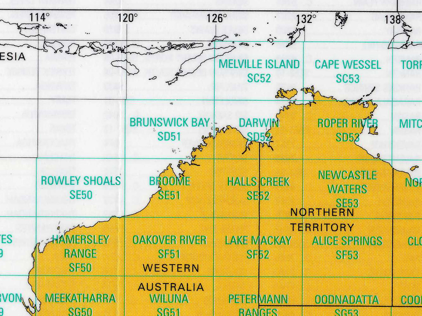
Both the International Map of the World (IMW) and the World Aeronautical Charts (WAC) are international map series which show topographic (especially elevation) information.
The IMW topographic map series was developed in the early 1900s and the WAC series was developed in the mid–1900s. As an Internationally agreed series with a standard specification and a regular map grid, the IMW was the 'first of its type in the world.
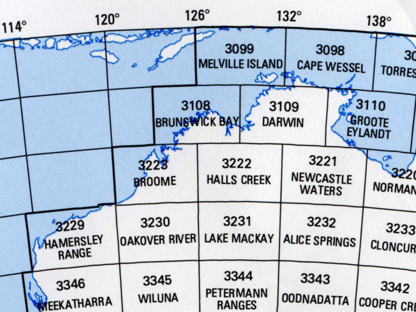
The WAC series was able to build on the work of the IMW series. To suit its needs (aircraft navigation) the WAC series adjusted the existing IMW sheet boundaries to maximise the amount of land it contained. (For more information see Types of Maps – Navigation Charts and Purpose of Your Map).
The interesting thing is that the WAC based its grid on the IMW grid, but on occasion it allowed for map boundaries to be slightly different, and in some cases individual maps overlap.
Compare these two extracts from 1) an IMW map index and 2) a WAC map index. Notice:
- How the IMW maps Brunswick Bay, Darwin and Roper River have been 'moved' to the east to maximise the amount of land that is covered by the map.
- That Brunswick Bay and Darwin have retained their IMW name, but Roper River has been renamed Groote Eylandt - because the Roper River is no longer fully covered by the map, but Groote Eylandt is fully covered.
- That the Broome, Halls Creek and Newcastle Waters maps are unchanged in extent and name
- How the Hammersley Range map has been extended a short distance to the north and west – allowing for it to fully cover the land mass. The IMW sheet to the north and west are not part of the WAC series.
- Finally, the two series use a different numbering convention.
Further Reading
- Geoscience Australia – Interactive Maps
- http://www.ga.gov.au/interactive-maps
- GeoSpatial Training and Analysis Cooperative (GeoSTAC) – Introduction to Topographic Maps
- http://geology.isu.edu/wapi/geostac/Field_Exercise/topomaps/index.htm
- Idaho Museum of Natural History, Digital Atlas of Idaho – Understanding Topographic Maps
- http://imnh.isu.edu/digitalatlas/geog/basics/topo.htm
- McDougall Little – Classzone, How Are Landforms Represented on Flat Maps?
- http://www.classzone.com/books/earth_science/terc/content/investigations/es0307/es0307page02.cfm
- Mount Union College – Reading Topographic Maps
- http://raider.mountunion.edu/~mcnaugma/Topographic%20Maps/topomapindexpage.htm#Menu
- Mount Union College – Contour Lines
- http://raider.mountunion.edu/~mcnaugma/Topographic%20Maps/contour.htm
- Mount Union College – Reading Elevation
- http://raider.mountunion.edu/~mcnaugma/Topographic%20Maps/reading_elevations.htm
- RMIT University – Basic Map Skills
- https://www.dlsweb.rmit.edu.au/toolbox/splash/toolbox_11_04/uoc5/html/p1basic.htm
- RMIT University – Understanding Topographic Maps
- https://www.dlsweb.rmit.edu.au/toolbox/splash/toolbox_11_04/uoc5/html/p2topo.htm
- Robert Davidson – Reading Topographic Maps - A Free On-Line Book on How to Read Topographic Maps and Use a Compass
- http://www.map-reading.com/
- University of Portsmouth – Map Features – Relief
- http://www.geog.port.ac.uk/webmap/hantscat/html/ftr_hil.htm
